Bareksa Super App Redesign
Reimagining Indonesia's trusted investment leader for evolving user needs

Project Details
- My Role
- Product Designer Manager (Visual, IA, Interaction Design, Research Strategy)
- Team
- 1 Product Designer Manager, 2 Product Designers, 1 UX Researcher, 1 PM, 1 Engineering Lead
- Timeline
- December 2021 – December 2022 (12 months)
- Platform
- Mobile (Android & iOS)
- Users
- 3M+ retail and institutional investors
- Tools
- Figma, Google Firebase, Mixpanel
Project Overview
When Bareksa's trusted investment platform faced declining engagement among millennial users, our team led a comprehensive redesign initiative. Over 12 months, we transformed the mobile experience through strategic research, design system development, and user-centered solution design. The project addressed the critical challenge of maintaining credibility with high-net-worth users while attracting the next generation of digital-native investors.
Key Objectives
- •Redesign Bareksa to serve millennial investors while maintaining HNW user trust
- •Reduce onboarding drop-off by over 20% through simplification and embedded guidance
- •Create a modern, scalable design system that supports cross-asset investing
- •Improve perceived credibility via enhanced visual language and interaction patterns
- •Increase active engagement and reduce visual fatigue in portfolio and homepage interactions
When Trust by Legacy Becomes a Design Bottleneck
By 2021, Bareksa had become a dominant force in Indonesia's investment market, serving millions of users and offering over five asset classes. However, the design, once a source of confidence for high-net-worth clients, inadvertently created friction and disengagement for a rapidly growing base of digital-native millennial investors.

Market Leadership Challenge
Emerging competitors are capturing younger audiences with modern, interactive experiences, challenging established players to evolve.

Generation Divide
Millennials and Gen Z dominate the user base but show low long-term engagement, signaling a disconnect with the current product.

Behavioral Friction
Onboarding drop-off is high and engagement in core flows like asset exploration remains low, signaling weak user motivation to explore the app.

Competitive Pressure
Modern fintech interfaces are setting new user expectations, intensifying the race to deliver seamless and delightful experiences.
Future Opportunity at Risk
Millennials were driving the next wave of adoption, but the existing design created a significant barrier. The mobile UI's lack of polish, readability, and contextual support actively risked loss of market relevance, even with strong underlying product fundamentals. This presented a critical opportunity to adapt.
Relied on data density, accustomed to traditional financial interfaces, high trust in legacy UI.
Sought intuitive, visually clear mobile experiences, valued simplicity and contextual guidance.
Expected highly visual, gamified, and seamless mobile-native interactions.

The Perfect Storm
Quantitative data revealed symptoms, but deep qualitative insights exposed the root cause. An erosion of trust driven by fragmented user experiences. The redesign demanded more than new screens. It required fundamentally rethinking how clarity, trust, and education were designed into every interaction.
Visual Legacy
An outdated UI lacked modern polish and consistency, creating a perception of stagnation.
Fragmented Journeys
Key investment workflows were inconsistent, leading to disorientation and increased cognitive load.
Education Gap
Crucial financial education was buried, forcing users to leave the app for information.
Brand Detachment
The app's tone felt overly formal, failing to connect with users on a personal or reassuring level.

Legacy Homescreen Design

Legacy Portfolio and Assets List Design

Legacy Transaction and Illustration Design
Our design team sought a challenge:
How might we reimagine Bareksa to attract the next generation of investors without disengaging existing high-net-worth users?
Uncovering the Real Problem
We conducted a design audit, cross-referenced app analytics, and synthesized qualitative interviews and NPS feedback to identify how UI and structural clarity influenced user trust.
Research Methods

Design Audit
Internal Team Audit of the existing app.
Uncovered 15+ major inconsistencies in core user flows.
Impact: Prioritized the creation of a unified Design System to ensure consistency.

User Interviews
18 Investors Interviewed from HNW & millennial segments.
Millennials articulated a strong preference for modern, vibrant, and interactive interfaces, perceiving these as critical indicators of trustworthiness and credibility.
Impact: Informed the development of a new design system with a vibrant color palette, refreshed iconography, and contextual UI components.

NPS Analysis
1,200+ User Responses analyzed for feedback patterns.
Pinpointed 4 recurring themes of user friction: clarity, navigation, trust, and mobile experience.
Impact: Provided robust quantitative validation for key problem areas, shaping the strategic focus for the redesign.
Research Artifacts

Design Audit
Mapped legacy UI patterns and visual language inconsistencies

User Interviews
Conducted 1:1 sessions with both HNW and millennial users

NPS Analysis
Clustered verbatim comments over time to identify pain trends
Delving Into Research
Why do millennials abandon the onboarding?
20% task failure rate for first-time investment completion
Insight: Information density creates decision paralysis
What signals trust to different user groups?
Traditional users value data density, millennials value simplicity
Insight: Trust perception varies by generation
How do inconsistent user flows impact engagement?
Fragmented user journeys led to significant cognitive load and increased abandonment rates.
Insight: Consistency builds confidence and reduces friction.
How does legacy UI impact user perception?
Legacy UI called 'stagnant' hurts NPS, deters new users
Insight: Modern, evolving design is critical to compete and retain new audiences
At the end of research
Research conclusively demonstrated that trust was eroded by muddled design and poor information architecture, not feature gaps. This underscored the strategic imperative to redefine visual hierarchy, enhance clarity, and establish intuitive interaction patterns.
Design Principles
Principles form a foundation for building cohesive and coherent digital product that is not only aesthetically pleasing for our user but also driving business vision forward.
Biome Design Principles

Conveniently Contextual
Simplifies investing with a clean, convenient experience, focusing on user needs.

For You Innovation
Embed personalized entry points and exploratory depth

Empower Credibly
Use typography, iconography, and layout to project trust
Strategic Considerations
How do we balance complexity with simplicity?
Progressive disclosure allows depth without overwhelming
Insight: Context determines information hierarchy
What framework serves both user groups?
Dual-mode interface adapts to user expertise level
Insight: Personalization enables inclusive design
How do we maintain trust during transformation?
Gradual migration preserves user confidence
Insight: Change management is crucial in financial apps
What metrics validate our approach?
A/B testing confirms improved user satisfaction
Insight: Data-driven validation builds stakeholder confidence
At the end of strategy
Our principles guided a balanced experience, blending intuitive simplicity for new users with robust credibility for established investors and providing a foundation for future innovation.
From Insight to Interface
We redesigned Bareksa's interface to be modular, precise, and easy to read, creating a seamless experience for frequent mobile users without sacrificing depth or credibility.
Design Iterations

Iteration of new Iconography, following Biome principles
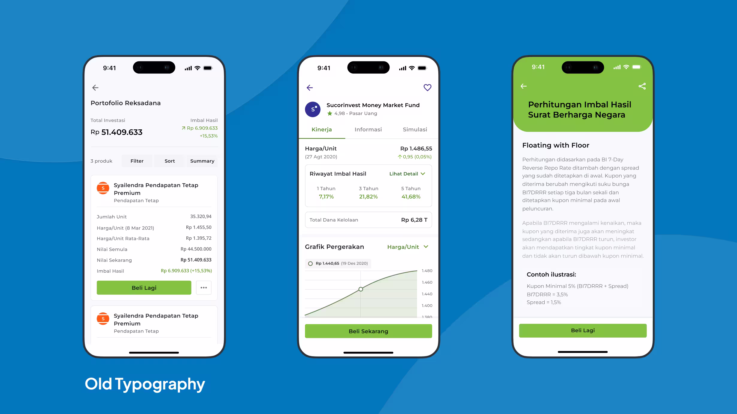
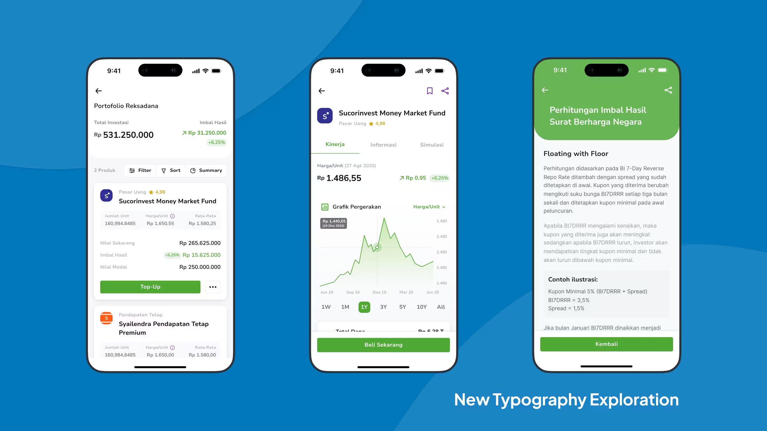
Compare typography iterations - drag the slider to see before and after
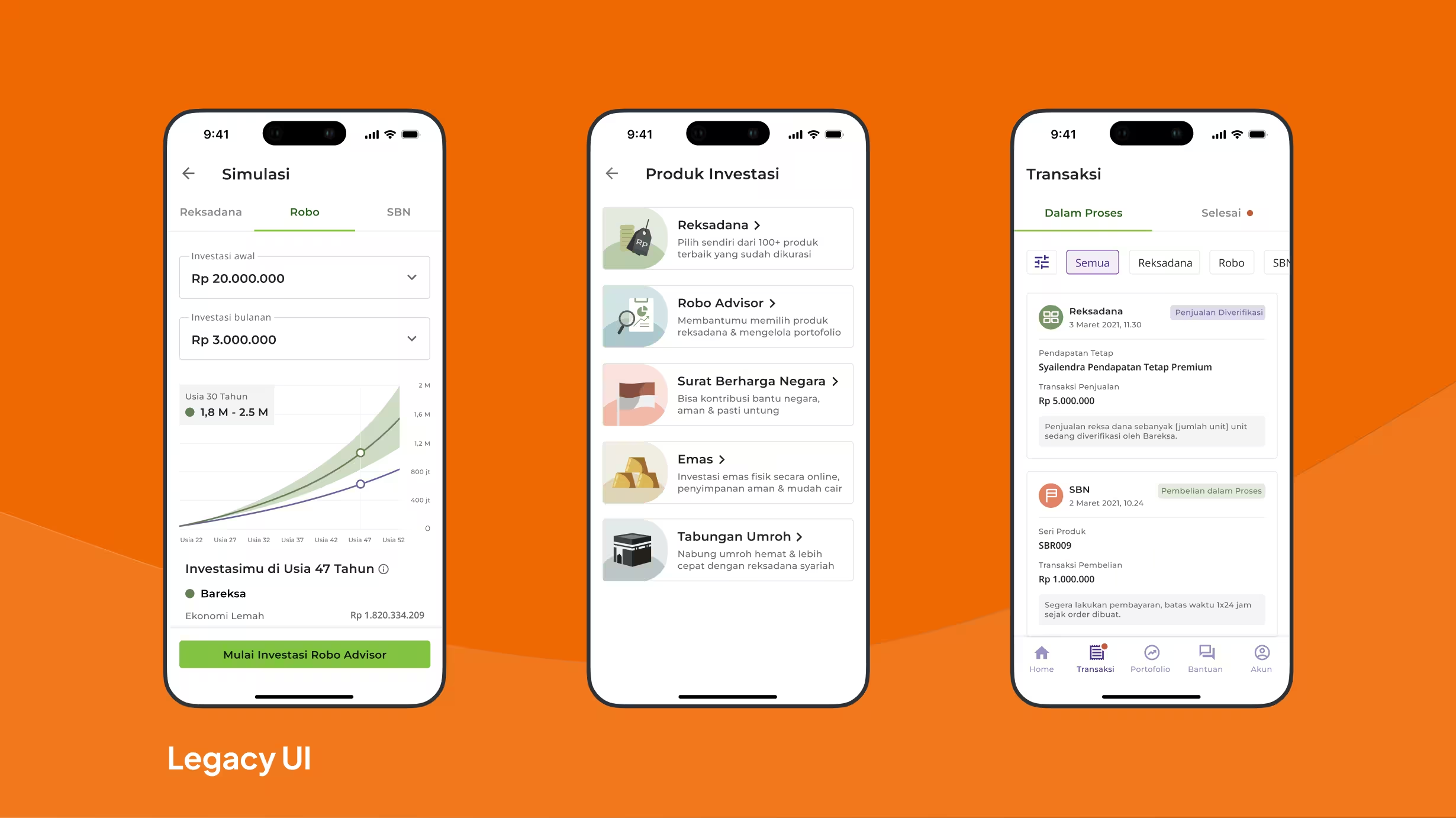
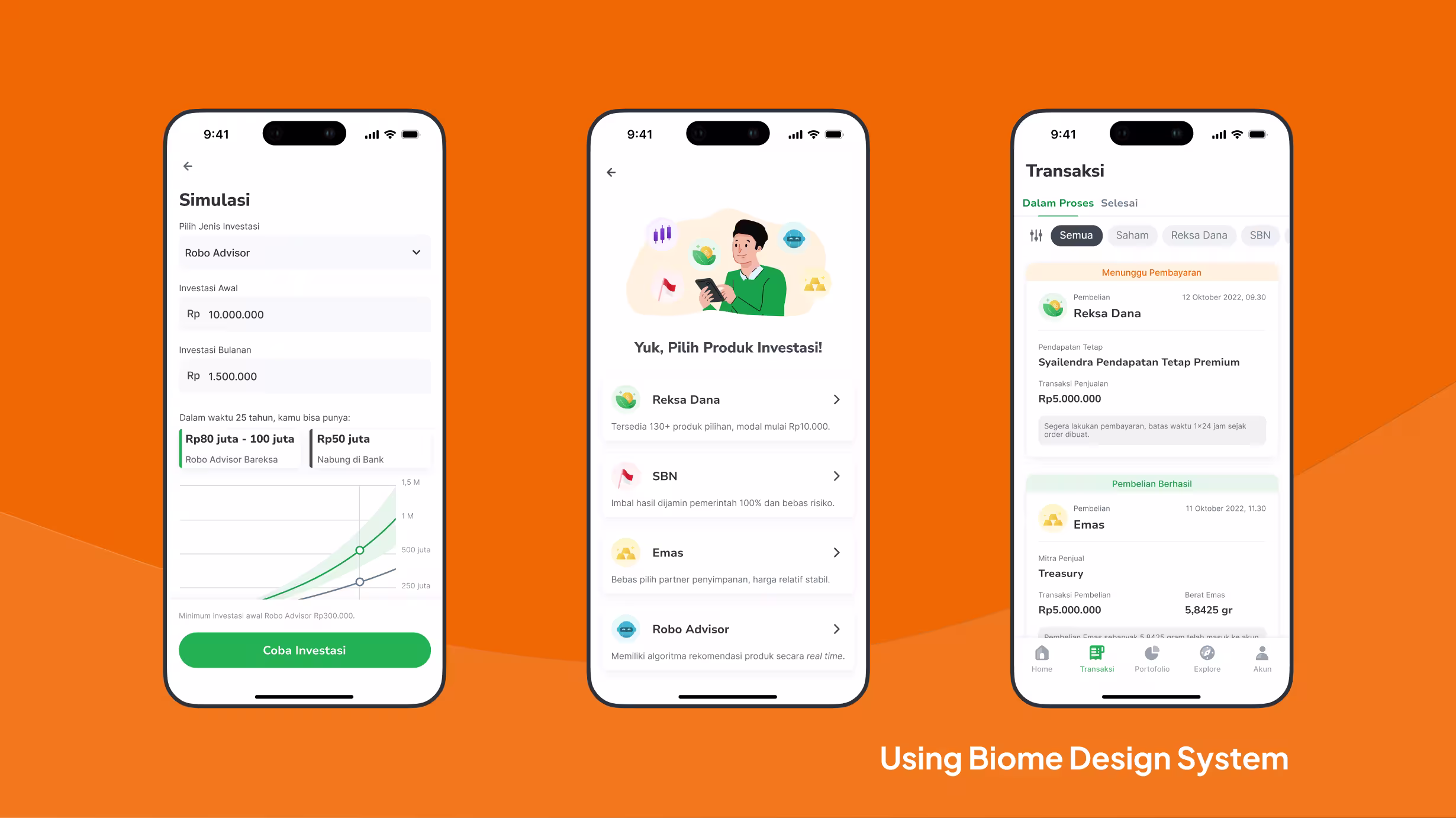
Compare Biome UI components implementation - drag to see before and after

Iteration of the Homepage UI design
Solution Components

Design System Development
Built reusable, scalable components and standardized UI guidelines

Visual Language System
Built contextual icons, vibrant color hierarchy, and intuitive visual cues

Illustration Strategy Overhaul
Redesigned illustrations to align with design principles and improve clarity

Visual Accessibility Enhancements
Improved contrast, font pairing, and spatial balance
Bareksa makes investing easy and trustworthy for over 3 million users in one unified app.
A modular design system, new homepage, and dynamic portfolio give Bareksa users clear, confident investing. Each part reduces hesitation and boosts understanding for modern investors.


Information-Prioritized Homepage
Surfaces insights and recommendations instantly

Dynamic Portfolio Dashboard
Real-time performance, clear asset breakdowns

Systematic Typography Strategy
Precision and clarity for text and numbers

Component-Driven Design System
Scalable, consistent patterns for every launch
At the end of solution
This redesign redefined Bareksa's mobile experience by communicating features with visual clarity and brand trust, not by removing them.
Impact & Results
The redesign delivered measurable improvements across user engagement, retention, and brand perception, validating our strategic approach to balancing trust and modernity.
Additional Outcomes
Enhanced perceived credibility across demographics while maintaining trusted brand identity
Established scalable design system enabling faster future feature development
Improved cross-platform consistency reducing development overhead
Strengthened market position among millennial demographic without alienating HNW users
Takeaway & Reflection
Redesigning Bareksa made me rethink how trust is built. I learned that trust is something you have to earn at every touchpoint, through clear communication, consistent details, and thoughtful execution. In fintech, visual polish and perceived safety are tightly linked.
A big moment for me was seeing that millennial users didn't want things dumbed down. They wanted less noise and more relevant signals. For them, a modern, clean interface was shorthand for credibility.
I realized Bareksa's legacy design had real value for long-time users. Instead of a total overhaul, I focused on evolving the experience, balancing new ideas with respect for what loyal users already trusted.
If I could do it again, I would get stakeholder buy-in with a more thorough alignment process, since so many teams were involved. I would prepare detailed, tailored explanations about the project for each group. This would make collaboration smoother and help everyone move forward together.
Building the new design system was a game-changer for me. It brought product, marketing, and engineering together, giving everyone a common language for credibility, clarity, and care.
Thanks for looking at my case study!
This wasn't just a visual refresh. It was a strategic push to rebuild trust across the entire experience. If you want to dive deeper into the decisions, process, or metrics, I'm happy to chat.